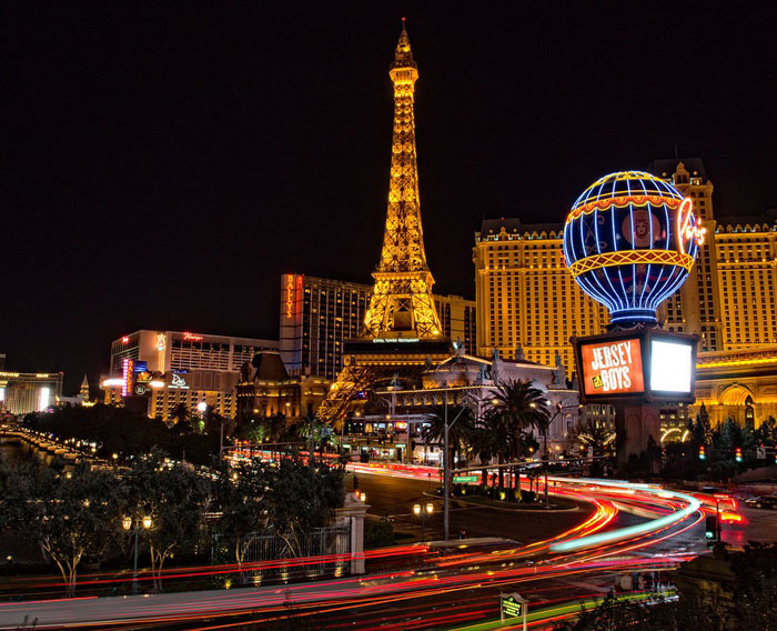
One of the most important attributes of the city of Las Vegas are the casinos. But it is not the reels, the cards, and the slot machines that give these casinos their identity, but the architecture of the casino buildings. The competition between the casinos and the need to make this business as aesthetic and elegant as what happens inside has kept a very healthy competition among the casino owners. Las Vegas is actually one of the cities where you will see the most breathtaking skyscrapers and towers and they are mostly casino buildings.

There is psychology involved in designing a casino. There has been an evolution in the casino architecture and we will look at some of the significant trends below.
Elements of Emphasis at Different Times
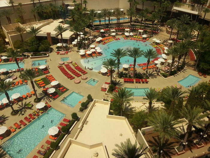
Apart from the skyscrapers overlooking the skylines of Vegas, the casino complexes have been distinguished with the help of different elements in the past. The most significant three are the swimming pools, the signs, and the porte cochère. Now, it is not like these elements die down after reigning but the emphasis moves from one to the other. Around the 1950s, the major emphasis of a casino complex was an array of swimming pools. During this era, the pools were so significant that the competition was about their size and positioning. That was why those who attracted more customers were those who positioned their pool in a place where it would be visible even to passersby. They are Olympic size pools with the best designs of the time.

After the pools, porte cochère became the trend in the 1960s. This was the time when everybody wanted to make the entrance to their casino something amazing. The piece of coach gate, portico, or carriage porch was either positioned at the major or secondary entrance to the casino. This allowed the occupants of cars to disembark under covered roofs. The utility, which included shielding people from the rain and the sun while they came out of the vehicles was never the emphasis. Of course, they were nothing like a pocket fruity review that can explain games to the customers. It was always only about style and glamour.
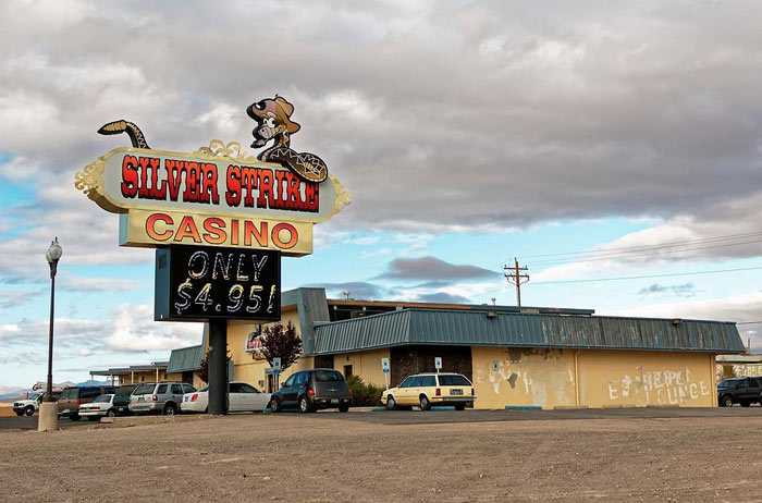
When it got to the 1970s, the sign posts took over. Every casino tried to outdo the other with flashing signs that were powered by electric current. The bigger and the brighter your sign was, the better.
 Modern Day Casino Architecture in Las Vegas
Currently, while the imposing high rise buildings are still the order of the day, their interiors and how they affect the gamers’ psychology are paramount. That is why you will see windowless walls as a prevalent feature of large casino halls. This is used to create a cave mentality that does not allow people to know whether it is night or day so they don’t consider leaving anytime soon. The next is how the games are positioned. Many people do not understand the effects of impulse control. But the casino owners do. So they place the irresistible games at strategic places to make people stay longer.
 While the traditional designs worked, the modern day architects are focusing on making the interiors look luxurious. There are tricks that casinos use to make people stay there longer and play more. Las Vegas has a very distinct casino architecture with enormous buildings surrounded by pools and fountains that attract the tourists and gamblers alike.


